Typojanchi 2017 : Body & Typography
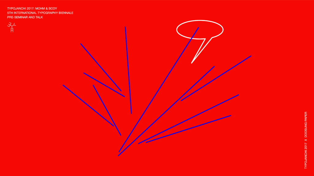
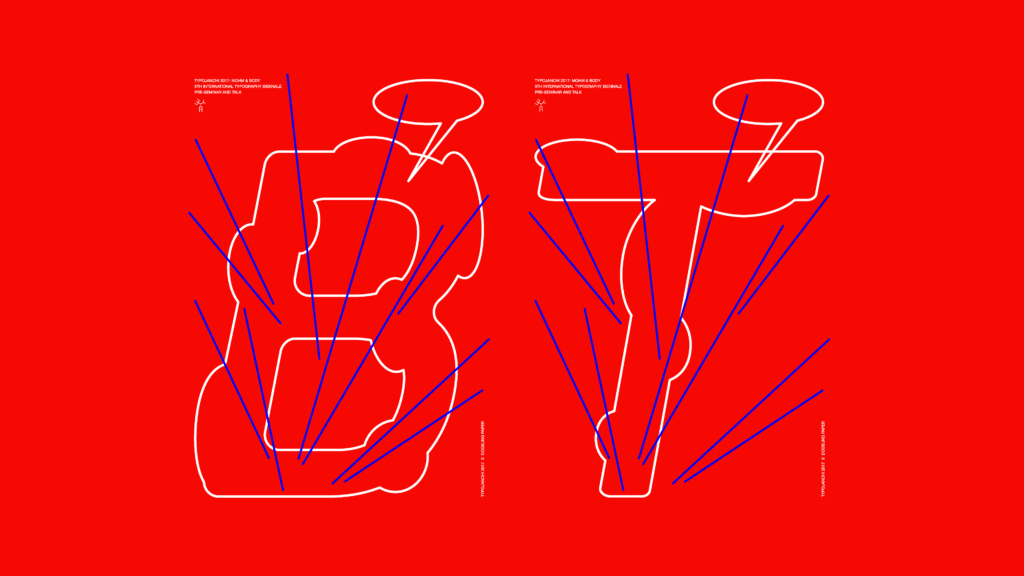
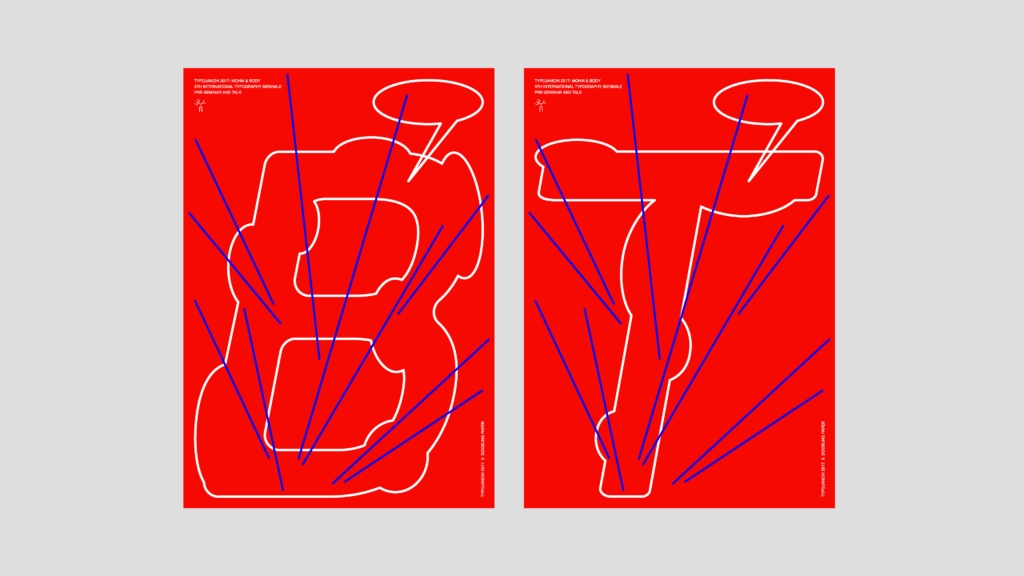
Mohm is the Korean word for body and the motto of Typojanchi-the 5th International Typography Biennale. The work announces the preliminary talk and seminar of the event. In this context, the letters B and T, which are the key elements of the design, stand for body and talk. The typeface and the fine white lines make the contours appear to be flexible and in motion. In contrast to that, even with respect to color, stand the straight blue lines, which intersect the letters and visualize communication strands. The speech bubbles are a visual reference to the lecture held as part of the seminar.